My top five favorite EXO logos before their comeback

Fans are excited to see the evolution of EXO logos in every era. But while waiting for their upcoming release, I would like to share my favorite EXO logos. South Korean boy group EXO is recognized as the Nation’s Pick by the Korean Government in 2018. They are one of the K-Pop artists that introduce Hallyu or the Korean wave to the world.
When they debuted in 2012, their logo is hexagon-shaped with white lines to highlight their name EXO. Since one of the identities of every group is their logo, fans did not expect them to release a different logo every comeback or era. From EXO’s hexagon-shaped logo, it evolved into a heart-shaped, maze, coins, and flags.
To appreciate more of its beauty, here are my top five favorite EXO logos before their comeback
LOVE SHOT

The group released this stunning diamond logo for their 5th album repackage in 2018. The shining parts bring out their group name which will probably show on every side of the diamond. This ranks first because of its dazzling appearance and precious output. Moreover, the front also looks like the XOXO album’s heart-shaped logo from 2013.
Overdose

Overdose, the third extended play of the boy group presents a maze logo. Many fans create theories connecting this logo to their songs’ storylines. For me, it is a genius idea to incorporate the group’s name into a maze and showed it in their music video.
THE POWER OF MUSIC

Their fourth repackage album opted for the comic idea, similar to the Power music video. Furthermore, the EXO hexagon was constructed with nine strong arms representing the nine members. As for me, it strongly conveys how they are stronger together and have that Power.
THE WAR

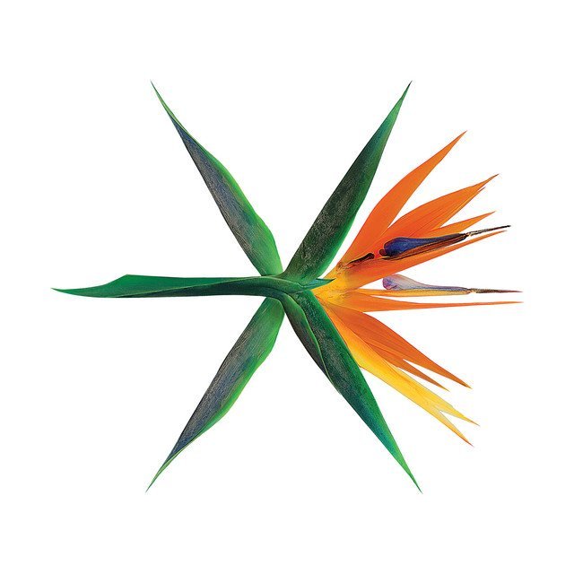
The three EXO logos they released for this fourth album were aesthetically based on plants – specifically the birds of paradise. The other two presented nine leaves for the members which also symbolize pride. In addition, this specific album cover also carries the idea of the boy group’s blooming career.
OBSESSION

This album’s concept depicts the conflict between EXO and X-EXO (clones of the original members). It is such a great idea that the logo consists of two black flags with diagonal white stripes. The handles crossed in the shape of an X complete the abstract EXO.
With their artistry in presenting different logos in every era, we cannot wait to see more! What do you think they will show in their next comeback? Share it with us!
Janelle is a full-time K-Pop fan but is also an active campus journalist since elementary. She loves to watch movies, but television series have a special place in her heart. She is also into romantic-comedy and the slice-of-life genres.


