My favorites from Pantone Color of the Year’s 23-year-roster
As annually anticipated, on December 2022 Pantone unveiled the defining Color of the Year. The rouge, vivid, and daring hue of Viva Magenta.
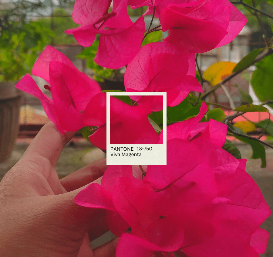
Long Live, the Lively Life of Viva Magenta (18-750)
Sharing similar traits with its predecessors, Viva appears more vibrant than 2015’s Marsala, while being reminiscent of 2001’s Fuchsia Rose. 18-750 bridges the liminality of the virtual and the reality.
Waving the velvety banner of vigor from the eclectic challenges faced by the world in the past years. Viva dances in newfound strength donning a, as Pantone describes; ‘brave, fearless and pulsating’ countenance. Pulsating in our state of revival, recuperation, and ‘optimistic’ redemption.
To the spectators’ delight and anticipation, Pantone ushered us to their fantastical visuals, with scintillating and gleaming facets (as shown in their presentations). Palpable is the haze in the ambiance which reminds us of the certain uncertainty of each commencing year, with a dizzying fascination with the possibilities to come.
The closest local bloom with its color that I could think of is the Bougainvillea, sprawling elegantly and often carefreely in the humble alleyways of our neighborhood. Only that Viva Magenta is unapologetically raucous.
Roster of colors
In more than two decades, Pantone provided us with a magnificent roster of colors. The collected tiles all makeup for a good palette, as YouTuber and Graphic Designer Karen Kavett puts it. And indeed, all these tiles and the stories behind each one are lovely windows to behold and peruse.
As we count the days down before 2023, let us take a brief trip down the colorful staircase of Pantone’s history and its iconic annual color pageantry. Dive into the endless spectrum of possibilities, moments before the ‘Magentaverse’ takes over.
Best-loved for two decades
The Color of the Year’s two identifications will always be pretty to me. Respectively, the number code and its fancy name which add up extra flair and meaning to the already symbolic patch in the spectrum. As Laurie Pressman, Vice President of Pantone Color Institute, explains in an interview,
“The name of the color also needs to help the story. Names immediately conjure up an image. We want to make sure that the name of our Pantone Color of the Year resonates and can easily and intuitively convey the message we are looking to send.”
I liken this classification to that of a species’ general and scientific name. And throughout this celebration, I am drawn to specific stories of select years. Without further ado, I present to you my simple roster of favorites.
Cerulean | 15-4020 – Year 2000
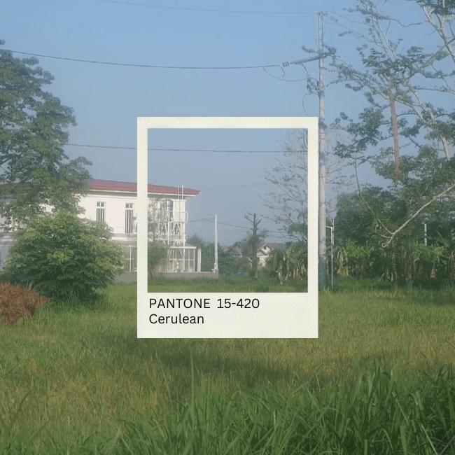
Cerulean defined the preceding year of my birth. Reminiscent of Claude Monet’s sprightly blue in his canvases, and a seaport in one fine and easy afternoon. The tranquil blue hue ushers the start of a fresh millennium, the year that also precedes many technological leaps. Like a canvas bathed in blues, with an alluring depth of skies and seas kissing at the horizon. In material form, 15-4020 illustrates delicate and soft bleached denim. And I can’t help but think of my favorite faded jumper skirt with the exact same shade.
Honeysuckle | 18-2120 – 2011

The youthful glow of the Honeysuckle reminds me of a sweet amble in the garden of its titular flower. A decade after Cerulean we’re introduced to the pinkish glow of the nectar-filled plant. Attractive and dainty in appearance, 18-2120 faces new travails in its pristine appearance, contrary to its predecessor, Turquoise 15-5519 which evades.
Greenery | 15-0343 – 2017

Salubrious and refreshing in nature, 15-0343 covers a huge array of greens you can think of. Beside my desk as of writing, my Chinese Evergreen plant thrives with its budding leaves, and on my surface is my best-loved teacup. Greenery brims in health, a color to definitely encourage productivity.

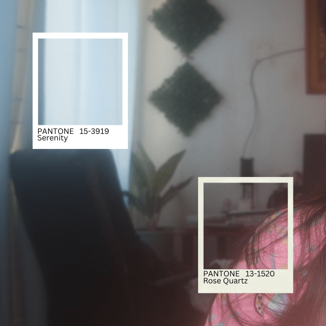
Rose Quartz & Serenity | 13-1520 & 15-3919 – 2016
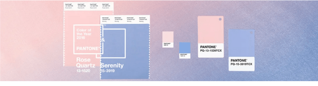
Softer than 2011’s, Rose Quartz complements well with its partner, Serenity. Scintillating yet delicate in appearance, the powder-like duet shine in crooning texture. When also matched together, they create a wintry and chilly feel, yet very amicable with each other and amiable to the beholder.
Very Peri | 17-3938 – 2022

The powder lavender hue is launched in the year of healing. A color that seemingly made its way also to the face of the PyeongChang 2018 Winter Olympics’ palette. Innocent yet majestic in look. This creamy yet solid lavender twilight evokes a sense of waking to a new hopeful morning. Very Peri bursts into a twinkling dawn.


A Brief History of the Pantone Colors
One can only desire to own a rainbow, (as futile as it sounds) much more; than a single hue. We can wonder how to do such a thing but the color giant, Pantone can be one to answer. The big name in color stands tall since the 1950s, while the famous hailing of the annual colors began in 1999, with the very first introduced in 2000.
Pantone established their titular method, the Pantone Matching System (PMS). One that provides a comprehensive guide to make sure that the exact color you fell in love with is applied to your walls or that the exact fabric you have in mind will be placed and utilized in your dress accurately. The standardized matching color system translates with consistency into both digital and industrial goods.
We owe the ingenuity to the former employee of the company, Lawrence Herbert. The idea sparked as he sought a way to deliver accurate shades to their clients as they are a printing company. Soon enough he would create the iconic tile card references the industry uses today. One that began as his humble do-it-yourself compendium of swatches with 40 initial colors.
With a humble start as a printing company, Pantone grew to become the industry standard in the color specification. Their expertise now expanded, from swatches to producing merchandise marked with their simple yet recognizable branding. Bearing the right to name the color that will paint the year, commercially and industry-wise.
“We all love our colors equally”.
While the Grammys pick an album of the year after, Pantone forecasts the very color as the year enters. Hailing the new year’s color does not determine which will bring the most luck. It is instead the industry’s blueprint to consider incorporating or utilizing in their designs. An important selection decided by color experts, with diverse backgrounds, sharing the same love and passion for the language of colors.
Pressman deems them as ‘color anthropologists.’ Individuals who “have this intuitive ability to connect to all that is taking place in the world and translate it into the language of color.”
One can wonder how an exact color is decided from a seemingly endless spectrum of hues. With now more than 3,000 classified colors in the macro hue scale. But no, it’s not done in one meeting, Pressman confirms. The Vice President also lists that the influences and factors range from color psychology and global trends, but never from personal biases of the members.
