Glyph Interface: Functional and Stylish

The Glyph Interface is Nothing’s take on phone design that is both functional and eye-catching. With their recent unveiling of the Phone (1), they showcased this unusual and new design that they came up with.
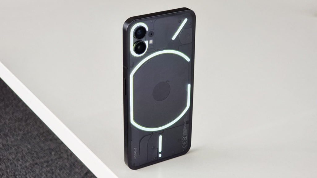
We can spot this design on the back of the Nothing Phone (1). The Glyph Interface of the Phone (1) consists of 5 strips of LED placed in a unique pattern underneath a transparent glass back. Now, any phone manufacturer can put LED light strips on the back of their phone and make it look catchy. But, the way Nothing did this is not purely for show. The design has a function.
How does the Glyph Interface work?
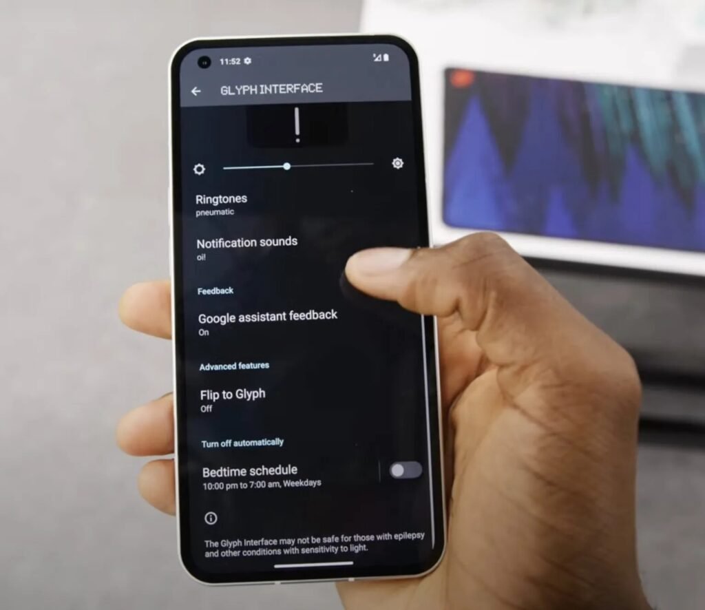
The Glyph Interface of the Nothing Phone (1) works in various ways. Aside from providing an amazing light show, it serves as an indicator for the user. For one, the Glyph Interface can act as Caller ID by lighting up the LED strips in unique sequences and patterns that specify which contact is calling. You can do this by choosing from one of the presets for the contacts on your phone.

Aside from working as a quirky caller ID feature, the Glyph Interface also serves as an indicator for notifications. It can be messages, app notifications, or any other general notification that there is. And another thing that it serves is as a virtual ringtone. In case you don’t hear your ringtone, the Glyph Interface will mimic your ringtone by flashing and lighting up in different patterns in a way that mimics the ringtone of the device.

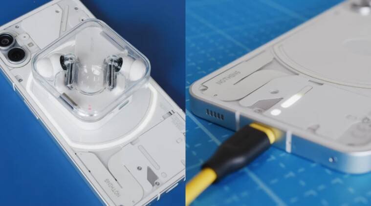
Not cool enough? The Glyph Interface also functions as a visual indicator of your battery percentage when you’re charging the phone. The way it works is a vertical LED strip that is placed at the bottom of the back panel fills up as the phone gets charged. This provides a visual of how much charge you currently have. And, since the Nothing Phone (1) is also capable of wireless charging and reverse wireless charging, an LED strip around the area where the wireless charging coil is located also lights up when in use.

One more use that the Glyph Interface has is to act as a fill light when you’re taking photos. This is because the LED lights on the back of the phone which makes up the Glyph Interface provide ample light to brighten up your photo or video’s subjects.
Does it have any drawbacks?
Yes, it does. The Glyph Interface can reduce battery life. Because, as it lights up throughout the day to inform you of your calls, notifications, and messages, it can also reduce your battery life. It also requires that you use a transparent case for your Phone (1). It’s probably not that bad if you use a transparent case because the Phone (1) and its design are beautiful. However, some people don’t prefer a transparent case.
The Glyph Interface also requires a bit of muscle memory to remember to place the Phone (1) face down every time you put it on a table or any other surface. Because using the Glyph Interface and placing the Phone (1) screen side up defeats the entire purpose of this design feature.
It can also get too eye-catching. If you’re in a public space like a hospital or a library, the Glyph Interface can get distracting. Imagine using this feature in a church during a mass. Too flashy right?
Is the Glyph Interface game-changing?
Frankly, the Glyph Interface looks more like a gimmick than a game-changing feature. It answers to non-existent problems in the hopes of standing out and looking cool. For example, the indicator for the battery percentage. Is it that much of a problem to light up the screen using tap gesture, or raising the phone, or clicking a button just to see the amount of battery charge that is already accumulated? not really. It is also unnecessary that they have to do this just to make an over-the-top LED light indicator. A simple dot of LED light at the top of your phone is enough to let you know that you have notifications. And, the same goes with the Glyph Interface’s thing on ringtones. It’s unnecessary, exaggerated, and not a stand-out feature.
But, it wouldn’t be fair to not give Nothing credit for what they did with the Phone (1). Despite being new to the smartphone game, they came up with something with an identity. Something that is uniquely Nothing.
It’s exciting to see what the Phone (1) will become in the future after it makes its way to the hands of consumers and receives updates. The Nothing Phone (1) certainly is eye-catching because of the Glyph Interface, and its design does serve a purpose, albeit unnecessary. So, if you’re looking to buy the Nothing Phone (1), don’t buy it for the Glyph Interface. It’s looking like a good phone if you can see beyond the flashy lights.
Gian is nerd, a big one. He is fascinated by technology and how it improves our day-to-day life, and if you happen to meet him, he’ll most likely geek out about the tech you’re carrying. He tends to find it hard to stop talking when asked about things that interest him, so he writes about it all instead.


